
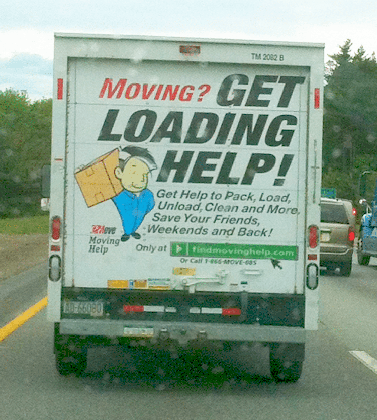
I was driving back from New Hampshire yesterday after hiking to the top of Mt. Jackson with a Scout Troop, when I saw a U-haul truck with a very interesting advertisement on the back. You can click on the picture to enlarge it – it’s an ad for a partner of U-Haul called “eMove”…the URL it gives is findmovinghelp.com. I don’t fully understand the relationship between the two companies, but this advertisement was *clearly* designed by an online marketer.
In fact, it looks like a perfect paid search landing page. Which isn’t a bad idea perhaps; I am no expert in outdoor advertising, but human nature is probably largely the same in front of a keyboard as it is in front of a dashboard.
Many principles ought to apply as best practices for *both* outdoor advertising and online advertising. Let’s dissect this ad and see what we can learn.
What Elements of the Perfect Landing Page Does it Have?
The ad has most of the elements of an ideal landing page – let’s call them out:
- A statement with which the viewer can “qualify” themselves – “Moving?”. This is a simple yes/no proposition, and can help get rid of viewers who are not true prospects for the product or service.
- A title that communicates the benefit, and also includes a call-to-action: “Get Loading Help!”
- A picture of a happy person with a smiling face, so the prospect can visualize themselves being successful with their task or problem, like that person.
- 3 bullets (in this case it looks like 5, a bit of overkill)
- A big fat button (I usually find Orange often works better than Green).
- Only one user interface element, the button – so the user can’t get distracted by leaving and going somewhere else.
- A little phone number, in case they want to convert offline (I’m not a huge fan of this, I would just put it in the upper right of the page, like the rest of the website. Given there’s no website at all here but just a rollup door I guess this works).
- The button has a second, more immediate, call-to-action integrated into it – in this case the domain- clearly the unspoken call-to-action is “Go to this address!”. I wonder what percentage of visits this company has been receiving from people on mobile devices right in their cars behind these vans!
What elements are missing?
- It doesn’t have links to a Privacy Policy or Terms of Service. It’s not widely understood, but if you don’t have these, your Landing Page Quality Score in Adwords (different than your Keyword or Creative Quality Score) will be lower than otherwise, and you’ll probably pay end up paying a higher Cost-per-Click as a result. Yes, I know – it’s a U-Haul truck – there’s no place for a PP or TOS, and driver behind the truck would be hard pressed to click on those links. Still, they’re worth mentioning for the sake of completeness.
- Many landing pages include a short two-sentence paragraph, positioning the product or service and making clear the benefit, or perhaps some text explaining what will happen if the person clicks, to reduce friction. Sometimes this can distract though; tests may reveal whether such an element is aiding or hindering conversions.
I must say I love the detail of the cursor hovering over the big fat button – the truck is basically communicating to the trailing driver “hey buddy, I want you to convert online”. Which is interesting because I think often we think of online people converting offline (like in retail or other B-to-C channels); this is a neat reverse twist on that.
Do You Know Anything About Outdoor Advertising?
What say you, reader? If you know anything of outdoor advertising best practices and have an opinion on this design, or any outdoor advertising best practices you think others should be aware of, please comment below!